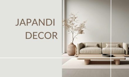
I can’t help but feel captivated by the oasis of calm that a Japandi color palette and the Japandi aesthetic offers in our fast-paced, technicolor world.
It’s an aesthetic whispers rather than shouts.
And it draws its inspiration not from the bright lights of the city, but from the muted hues of nature.
Here’s what you need to know when creating your own:
Base Colors: Start with a base of whites or off-whites. Think clean, bright Scandinavian designs. In terms of RGB color codes and hex codes, this includes shades like White (255, 255, 255), Snow (255, 250, 250), and Floral White (255, 250, 240). This block is snow colored, hex code: FFFAFA.
Neutral Tones: Next, bring in neutrals such as soft greys, warm browns, and muted beiges. These colors reflect the natural hues of wood, stone, and earth and give a nod to the organic love of both Japanese and Scandi designs. RGB color codes include Silver (192, 192, 192), Light Gray (211, 211, 211), and Rosy Brown (188, 143, 143). This block is a neutral brown, hex code: CEC0B5.
Touches of Green: Add elements of green to echo the Japanese reverence for nature. Look at a sage green (186,184,136) or Dark Sea Green (143, 188, 143) for inspiration. This block is a sage green, hex code: BAB888.
Hints of Black: Include a dash of black to add depth and definition to your palette. This brings in a touch of modern sophistication characteristic of the Japandi style. Black is represented by the RGB code (0, 0, 0), but this block has a hint of blue too and is a little softer, hex code: 323D43.
Balance and Simplicity: Remember, Japandi is about balance and simplicity. It’s about a palette that whispers rather than shouts, so avoid going overboard with color. The furniture and art in your space should work harmoniously with the color scheme, rather than against it. This block is a neutral beige tone, hex code: E0D6D4.
Planning and Testing: Use a color palette tool to plan and test your color scheme before you commit to painting or buying furnishings. This will help ensure the colors complement each other and your existing furniture. This block is a slightly warmer natural wood color, hex code: DDBFA3.
Flexibility: Don’t be afraid to tweak and change your palette as you go along. The key is to maintain a sense of calm, warmth, and connection with nature. This block is a richer earthy brown, hex code: 9E8B7D.
When I picture the perfect Japandi palette, I think of a forest at dawn – the soft greys of the morning mist, the gentle browns of the tree trunks, the quiet greens of the leaves.
In terms of the base, I’ve always loved using whites and off-whites, drawn from the Scandi influence.
From there, I like to bring in the neutrals – soft greys, warm browns, muted beiges. Basically, the colors of wood, stone, and earth.
A touch of green here and there echoes the Japanese reverence for nature, and using black adds that depth and definition to certain areas.
It’s a palette that doesn’t just look good – it feels good. And honestly, isn’t that what our homes should be all about?
In this article, I’ve created plenty of example Japandi color palettes based on real designs, and share my tips and tricks on how to make a color palette that’s right for your room.
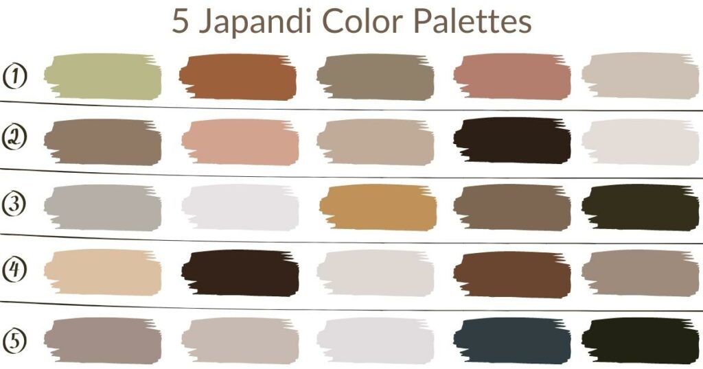
Japandi color palette codes
If I have to define the Japandi color palette with color codes, I start with a canvas of whites and off-whites that form the backdrop of the Japandi style.
In terms of RGB color codes, I’m talking about shades like White (255, 255, 255), Snow (255, 250, 250), and Floral White (255, 250, 240).
These colors remind me of the clean, bright expanses of Scandinavian interiors.
Next, the neutrals — we’re in the realm of Silver (192, 192, 192), Light Gray (211, 211, 211), and Rosy Brown (188, 143, 143). These are the colors of natural materials like wood and stone, a nod to both Japanese and Scandi love for the organic.
I love adding a touch of nature with shades of green, such as Pale Green (152, 251, 152) and Dark Sea Green (143, 188, 143).
Finally, a dash of black, like RGB (0, 0, 0), adds depth and definition, grounding the palette and adding that touch of modern sophistication that is so characteristic of the Japandi style.
Pro tip: For any designs and style you like, you can use a color picker tool to get the exact hex code for that color – for example, a chair you love the color of in one of my pictures, or a wallpaper tone etc. You can drag the color picker icon to the exact pixel of the image you like to get the hex code. You can then bring that color into your local paint shop on your mobile phone, or print it out, or just use it as a reference when you’re out shopping!
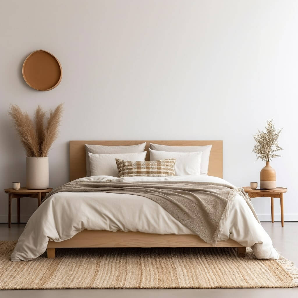
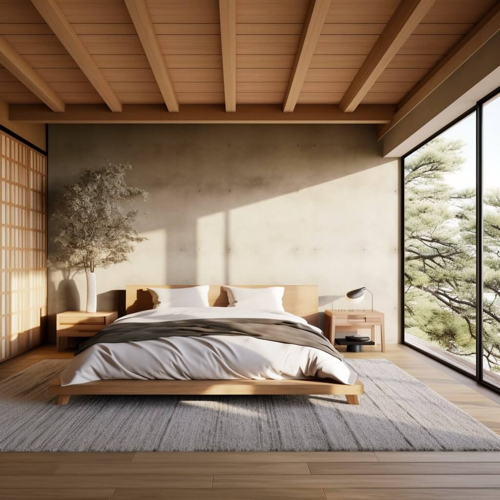
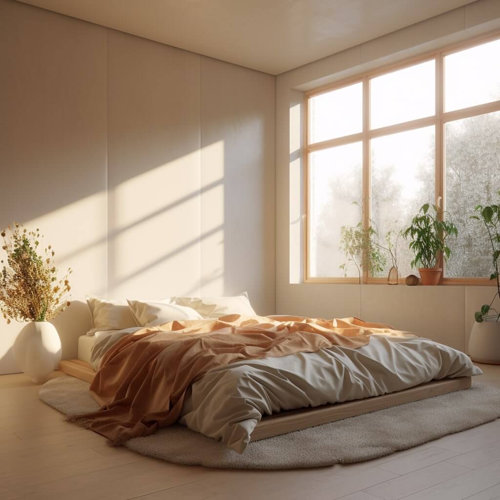
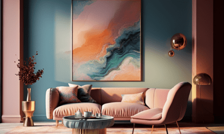
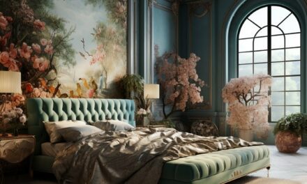
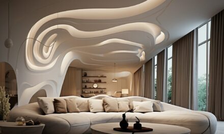
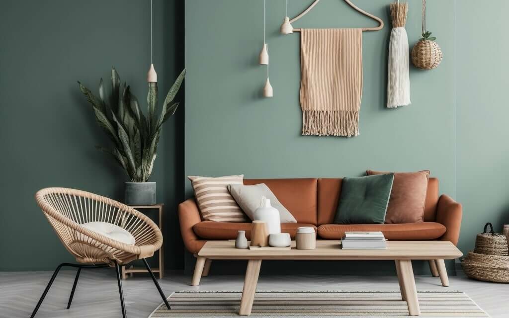
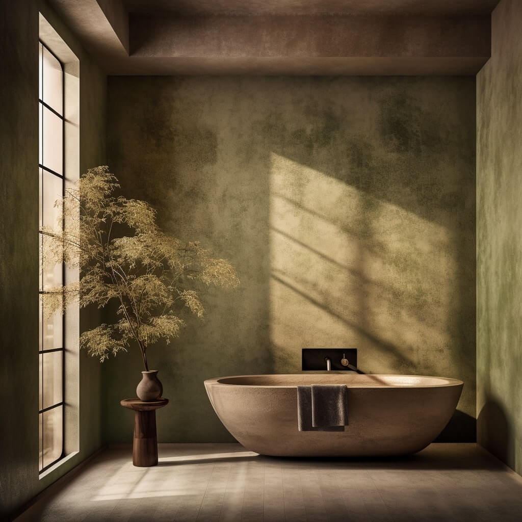
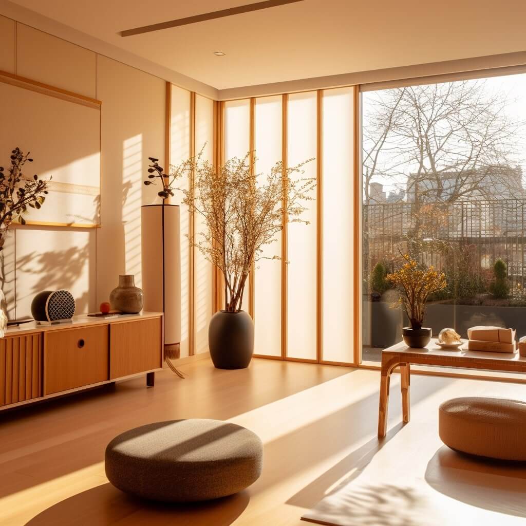
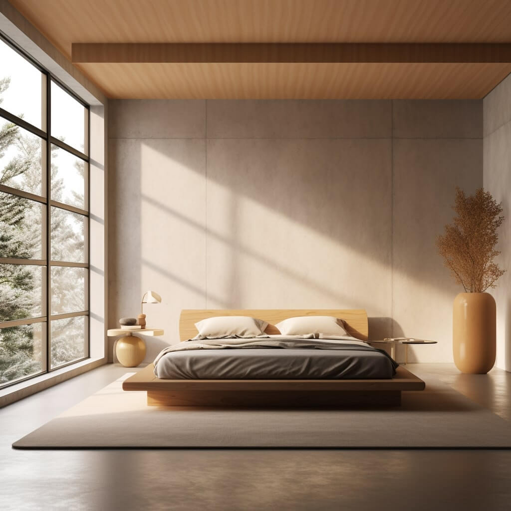
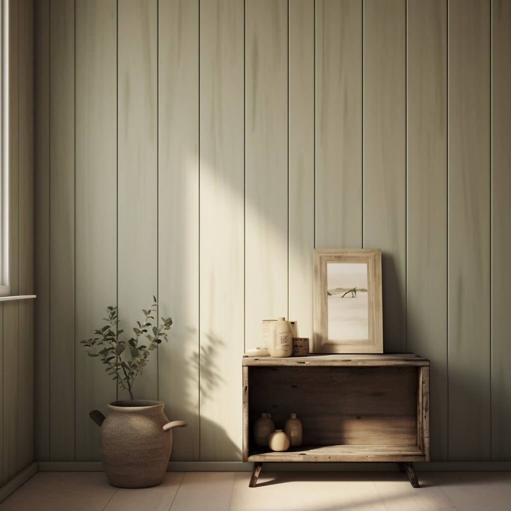
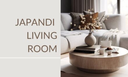
Japandi bedroom and living room colors
When I design a Japandi-style bedroom or living room, I see it as creating a sanctuary, a place where the hustle and bustle of the outside world fades away.
Again, I start with a base of whites or off-whites. Imagine snow falling silently on a Scandinavian forest.
The clean, bright simplicity of these shades provides a peaceful backdrop that I absolutely adore.
Look at the RGB codes like White (255, 255, 255) or Snow (255, 250, 250) as good starting points.
Next, I find myself drawn towards shades like Silver (192, 192, 192), Light Gray (211, 211, 211), or Rosy Brown (188, 143, 143). These shades infuse the space with warmth and an organic texture that feels just right.
Subtle use of shades like Pale Green (152, 251, 152) or Dark Sea Green (143, 188, 143) in accents or furnishings can do wonders.
Lastly, I may use a hint of black, RGB (0, 0, 0), but very sparingly.
Check out my gallery of over 150 Japandi ideas, each with their own unique Japandi color palette:


How to create a Japandi color palette
When creating your own Japandi color palette, I recomend trying out a tool like coolors.co. You can start with a base color and then improvise from there, or get automatic recommendations that go with your theme.
It’s a great way to test out a color palette to see if your colors compliment each other, before you go out and buy the paint!
Start with neutral tones as above, and then compare and contrast these to the furniture you own / you’re looking at buying.
Exploring and planning your color palette early on is often the key to getting it right – but you can always make tweaks and changes as you go with certain furniture pieces or even new paint jobs if you need.
While you’re here, check out my video on the essence of Japandi design and what it makes it so great:
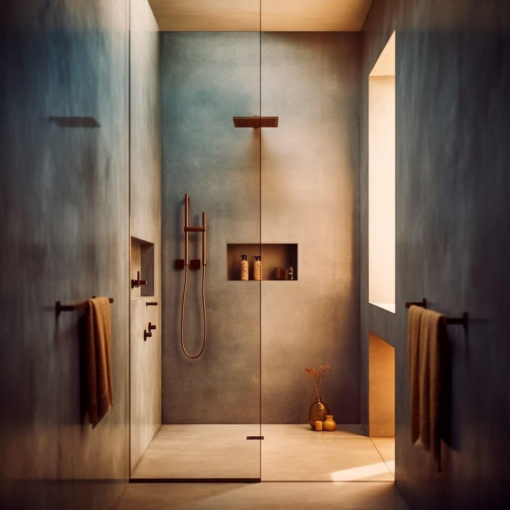
Japandi Paint
When it comes to Japandi style, I view paint as more than just a tool for covering a surface.
I tend to go for a palette that’s soft and earthy, drawing inspiration from the natural world.
I usually begin with whites and off-whites as the base. This is a nod to the Scandi love for bright, airy spaces.
Delicate, dove gray or a sandy, taupe beige, shades are popular and they provide warmth without overwhelming the senses.
For me, a touch of green or blue can be a real game-changer, bringing a hint of the outdoors in.
You don’t want to go overboard with color – this is where your Japandi style furniture and Japandi art can shine.
Japandi wallpaper colors
Personally, I tend to lean towards soft, earthy tones when selecting Japandi wallpaper colors. Whites and off-whites are the main two colors – anything else is probably overcomplicating things.
And, let’s not forget, Japandi wallpaper isn’t about bold, busy patterns. A subtle leaf pattern would be as far as I’d go if I really needed to.
But in my view, it’s about simple, subtle designs that contribute to an overall sense of balance and calm.
Japandi colors also work very well in combination with a retro look. I.e., Retro Japandi.


What colours are used in Japandi style?
Japandi style uses a muted, natural color palette, including soft neutrals, earth tones, and pastels. It often combines cooler Scandinavian hues with warmer Japanese tones.
What is the meaning of the Japandi color palette?
The Japandi color palette represents a blend of tranquility and warmth, mirroring the philosophy of both Japanese and Scandinavian designs – simplicity, functionality, and a deep connection to nature.
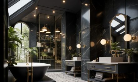
What colors are used in Japanese interior design?
Japanese interior design primarily uses natural, earthy colors including browns, greens, and creams, along with black and white for contrast.
What is Muji color?
Muji color refers to the color palette used by the Japanese brand Muji, known for its minimalist aesthetic. This typically includes soft, muted shades like beige, off-white, grey, and earth tones.
What are the 4 types of color palette?
The four types of color palettes are monochromatic (one color in various shades), analogous (colors next to each other on the color wheel), complementary (colors opposite each other on the color wheel), and triadic (three colors evenly spaced on the color wheel).
What are Scandinavian colours?
Scandinavian colours often include whites and light greys to reflect the Nordic light, complemented by pops of colour from the cooler end of the spectrum, such as blues, greens, and soft pastels.
What are Japandi Bedroom colors?
Japandi bedroom colors involve a harmonious blend of muted and natural tones, combining neutrals like beige and grey with deeper, comforting colors like earthy greens or browns, creating a tranquil, cozy space.
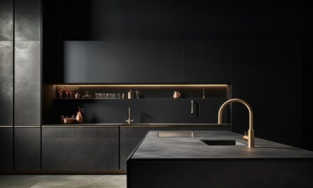
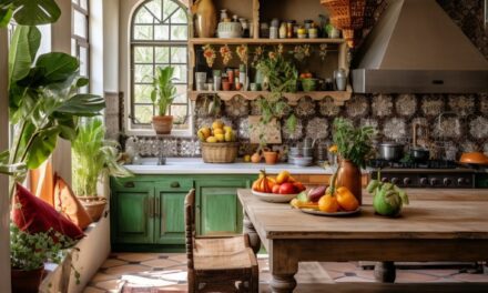
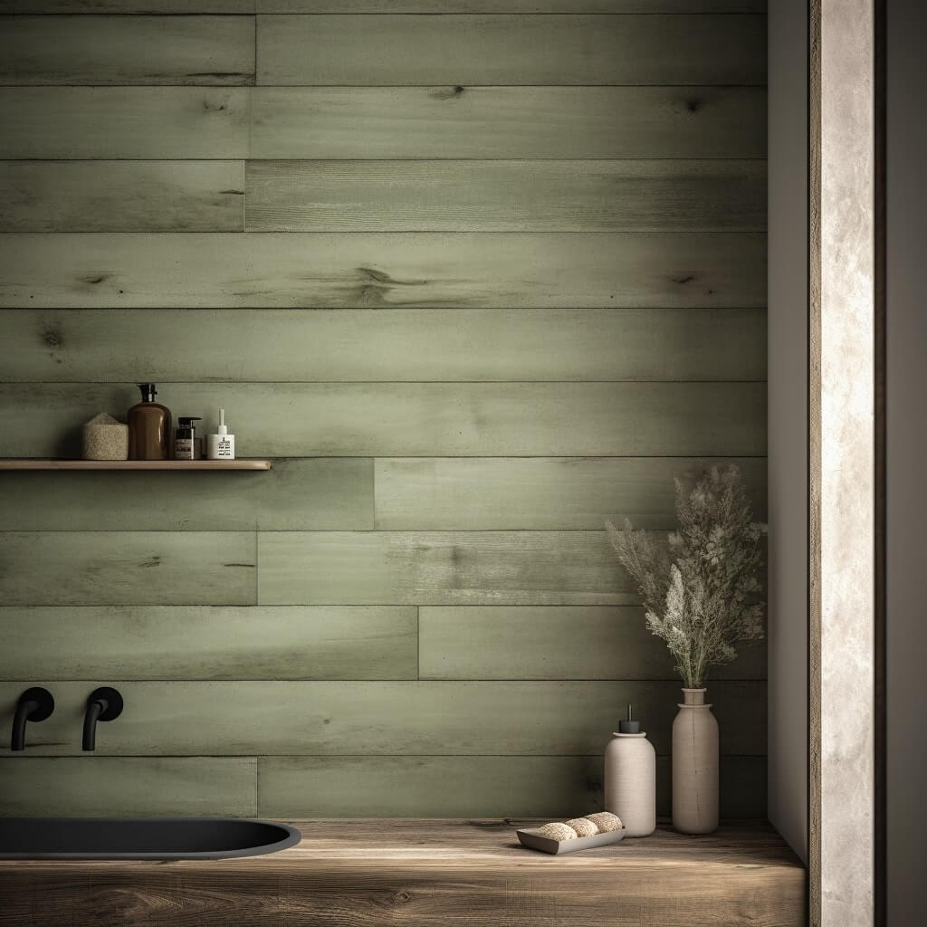
Japandi color palette for kitchen
A Japandi color palette for a kitchen would feature natural hues, incorporating neutrals like white, beige, or grey with earthy greens, browns, or even black for contrast, providing a calm, welcoming atmosphere.
What are the rules for color palettes in interior design?
Balance and harmony are key. Use the 60-30-10 rule: 60% dominant color, 30% secondary color, 10% accent color. Consider the room’s purpose, lighting, and size.
What makes a good colour palette in interior design?
A good color palette complements the room’s function, enhances the space, and creates the desired mood. It should harmonize with furniture and fixtures.
How many colors should a color palette have in interior design?
Typically, an interior design color palette has 3-5 colors. This includes a dominant color, secondary colors, and accent colors for highlights.
Can my color palette change in interior design?
Yes, color palettes can change to reflect seasons, trends, or personal taste. Changing accessories like cushions or art can refresh the palette.
How many colors is too many in a color palette for interior design?
More than five colors can make a room feel chaotic. Stick to 3-5 colors for a balanced, cohesive look.
Are color palettes important in interior design?
Absolutely. Color palettes set the mood, create harmony, and influence perception of space and light.
How do I choose a color palette for interior design?
Start with a base color you love, consider the room’s purpose and lighting, then choose complementary, analogous, or triadic colors. Use color wheel and digital tools for help as discussed earlier.
