


Hello, and welcome to my complete guide on neutral colors and how to pair them. Neutral colors are a fundamental element of any color scheme as they provide balance and harmony. They are versatile and can be combined with any color, making them an excellent starting point for any design project. Whether you’re looking to create a subtle and sophisticated look or want to incorporate bold, accent colors, neutral colors are the perfect foundation. In this complete guide, you’ll discover everything you need to know about neutral colors, from understanding their characteristics to experimenting with different combinations.
Key Takeaways:
- Neutral colors are essential in creating a harmonious color palette
- Neutral colors can be combined with any color, making them versatile
- Understanding the different neutral colors and how to pair them is crucial
- Experimenting with monochromatic, contrasting, and accent color schemes can add visual interest to any space
- Choosing the right neutral color combination for your project requires considering factors such as lighting, existing decor, and personal preferences
Understanding Neutral Colors
As a professional copywriting journalist, I have learned the importance of understanding neutral colors in creating a balanced and visually pleasing color palette. Neutral colors are hues that lack strong, distinct color tones and are often described as calm, soothing, and timeless.
Some popular neutral colors include beige, gray, taupe, and cream. Neutral colors are incredibly versatile and can be paired with almost any other color, making them a go-to choice for interior designers and fashionistas alike.
What makes neutral colors so special is their ability to complement other hues without overpowering them. They can help tie together a space, creating a cohesive and harmonious aesthetic. Understanding the nuances and subtleties of different neutral colors is crucial in achieving this effect.
Examples of Neutral Colors
| Color | Description |
|---|---|
| Beige | A warm, light brown with yellow undertones |
| Gray | A cool, muted shade that can range from light to dark |
| Taupe | A grayish-brown, often with hints of purple, pink, or green |
| Cream | A pale, off-white color with yellow undertones |
Neutral colors also come in a range of undertones, such as warm (yellow or red undertones) or cool (blue or green undertones). These undertones can make a big difference in how the color appears in a space and how it interacts with other colors.
Overall, understanding neutral colors is crucial in creating a successful color palette. By harnessing their versatility and subtleties, I can create a harmonious and cohesive look for any space or project.
Creating Monochromatic Schemes with Neutrals
Incorporating different shades of neutral colors is an effective way to create a cohesive and harmonious monochromatic color palette. When done correctly, a monochromatic scheme can add depth and interest to a room without overwhelming the senses. Here are some tips for creating a beautiful monochromatic scheme with neutral colors:
1. Start with a base color: Begin by selecting a neutral base color for the room. This could be a cool gray, warm beige, or a soft taupe. Choose a shade that you love and will be comfortable living with, as it will be the main color in the room.
2. Select varying tones: Once you have your base color, select varying tones of that color to add depth and interest. For example, if your base color is a warm beige, select a lighter shade for the ceiling, a darker shade for the floor, and medium tones for the walls.
3. Experiment with texture: To keep the monochromatic scheme from feeling flat, experiment with different textures. Mix and match fabrics, and incorporate different finishes such as matte and glossy. This will add dimension and visual interest to the room.
4. Incorporate pops of color: Even in a monochromatic room, it’s important to incorporate pops of color to keep the space from feeling too muted. Choose one or two accent colors that complement your neutral palette, and use them sparingly in accessories such as throw pillows, curtains, or a piece of artwork.
5. Consider lighting: Finally, consider how lighting will affect your neutral color scheme. Natural light can make colors appear differently at different times of the day, so be sure to test your colors in different lighting situations before committing.
By following these tips, you can create a monochromatic color scheme with neutral colors that is visually appealing and harmonious. Remember, the key is to select varying tones and textures to keep the space from feeling too one-dimensional.
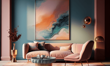
Pairing Neutrals with Accent Colors
While neutral colors can make for a stunning color palette on their own, they also pair beautifully with accent colors. Adding an accent color can give a space a pop of personality and interest, while still maintaining a sense of balance and harmony.
One popular way to pair neutrals with accent colors is through complementary color schemes. This involves choosing a color opposite your neutral on the color wheel, such as pairing a warm beige with a cool blue. This creates a high-contrast look that is visually striking.
Analogous color schemes are another great option when pairing neutrals with accents. This involves selecting colors that are adjacent to your neutral on the color wheel, such as pairing a gray with a soft blue or green. This creates a more subtle and calming effect.
For those who want to experiment with more complex color schemes, consider using split complementary color schemes. This involves choosing a neutral and then selecting two colors that are adjacent to its opposite color on the color wheel, such as pairing a cream with a deep purple and mustard yellow. This creates a dynamic and unique color story.
When incorporating accent colors into a neutral color palette, it’s important to ensure they work in harmony with the space and existing decor. Test out different color combinations and sample swatches before committing to a decision. Don’t be afraid to seek professional advice if needed, as color can have a significant impact on the overall look and feel of a room.
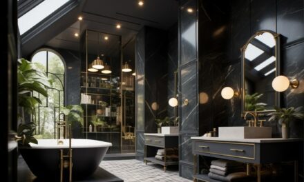
Experimenting with Contrasting Neutrals
While monochromatic schemes and neutral-accents combinations are timeless and safe bets for a stylish look, experimenting with contrasting neutrals can make a bold statement in any space.
One way to do this is by pairing warm and cool neutrals. Warm neutrals such as beige and taupe can create a cozy and inviting atmosphere, while cool neutrals such as gray and white can bring a modern and fresh feel. Combining them creates a perfect balance between warmth and coolness.
Another way to experiment is by playing with the contrast between light and dark neutrals. A light wall color with dark neutral accents can bring attention to certain elements of your decor while keeping a clean and sophisticated look. Similarly, a dark wall color with light neutral accents can make the space feel brighter and more open.
Remember to consider the overall design of the space and the mood you want to convey when experimenting with contrasting neutrals. Be confident and try different combinations to discover what works best for you and your unique space.
Tips for Choosing the Perfect Neutral Color Combination
When it comes to choosing the perfect neutral color combination, there are several factors to consider. Here are some tips to help you make the right decision:
Consider the Existing Decor
Take a look at the colors and patterns already present in the space you’re working with. You want your neutral color palette to complement these elements, not clash with them. Consider the furniture, flooring, and wall art to ensure that your neutral colors will coordinate well.
Take Lighting into Account
The lighting in a room can greatly affect how colors appear. Make sure to test your neutral color samples in both natural and artificial lighting to see how they will look throughout the day. Pay attention to how the colors may change in different types of lighting, such as bright overhead lighting versus soft lamp lighting.
Think About the Mood You Want to Create
Neutral colors can create a range of moods, from calm and serene to warm and inviting. Consider the purpose of the space you’re decorating and the atmosphere you want to create. For example, a bedroom may call for cooler neutrals to promote relaxation, while a living room may benefit from warmer neutrals to create a cozy atmosphere.
Don’t Be Afraid to Experiment
Choosing a neutral color combination doesn’t mean you have to stick to just one or two colors. Feel free to mix and match different shades and tones to create visual interest and depth. Don’t be afraid to try out contrasting neutrals or incorporating a pop of color as an accent.
Seek Professional Advice if Needed
If you’re feeling unsure about choosing the right neutral color combination, don’t hesitate to seek advice from a professional. An interior designer or color consultant can offer valuable insights and suggestions based on their expertise and experience.
By considering these factors and following these tips, you can confidently choose the perfect neutral color combination for your space and achieve the harmonious, visually pleasing aesthetic you desire.
FAQ
Q: What are neutral colors?
A: Neutral colors are hues that are not typically associated with a specific color family. They include shades such as beige, gray, taupe, and cream.
Q: Why are neutral colors important in creating a harmonious color palette?
A: Neutral colors serve as a foundation for a color scheme and help create balance and cohesion. They can complement and enhance other colors, making them ideal for creating a harmonious look.
Q: How can I create a monochromatic color scheme using neutral colors?
A: To create a monochromatic color scheme with neutrals, select different shades and tones within the same color family. This adds depth and visual interest while maintaining a cohesive look.
Q: How can I pair neutrals with accent colors?
A: There are several ways to pair neutrals with accent colors. You can use complementary color schemes, where the accent color is opposite the neutral on the color wheel. Analogous color schemes involve selecting colors that are adjacent to the neutral, while split complementary schemes use colors adjacent to the neutral’s complement.
Q: How can I experiment with contrasting neutral colors?
A: To experiment with contrasting neutrals, try pairing warm and cool neutrals or light and dark neutrals. This creates a visually striking look that adds depth and dimension to your space.
Q: How do I choose the perfect neutral color combination?
A: When choosing a neutral color combination, consider factors such as lighting, existing decor, and personal preferences. Test samples in the space and seek professional advice if needed to ensure you find the perfect combination for your project.
